Tell me...
1. Which you like better.
2. If you'd change to the new one.
3. Any other feedback you have
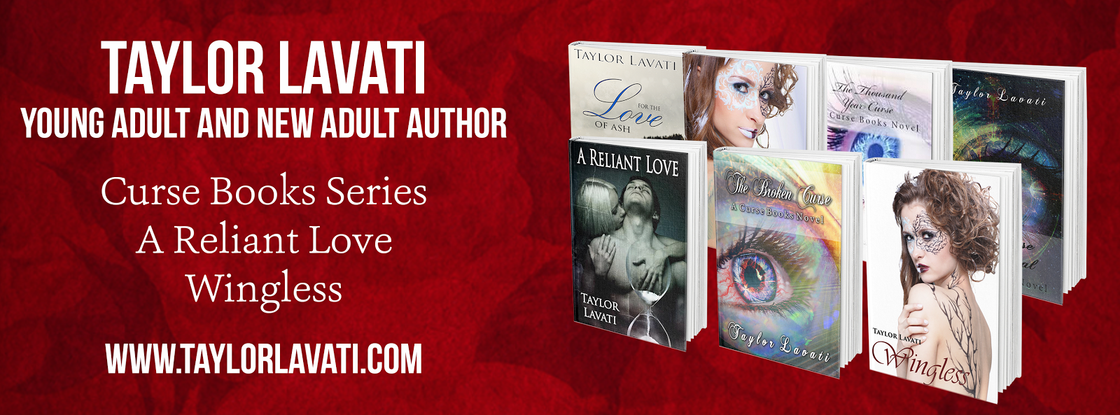
Here is the old one, which I LOVE, don't get me wrong. The reason I love this one was because of the feel you get. It's a little creepy and dark yet the rose stands in the middle. BUT it is a tad boring and I feel like maybe it won't get readers to click on it.

Here is the possible new one. I'm not going to say why I love it or what it means but those of you who have read the book may be able to understand why it's a good cover. I like the airy feel to it and it's not too dark. Another reason I like it is because I can use the same concept for the next two books.
.jpg)

Please, please, please. Give me feedback. I'm really on the edge here and am not sure whether I should change it or not. I'm having such an indecisive moment!!!!! If I did change the cover I would definitely want to do it now rather than later since the books only been out a little over a week.
Thanks guys. You're all the best!
Typesetting of title is too small on second one, cover is better though, think thumbnail so people can read it online and offline from 3 feet at a bookstore - Pierre Provost
ReplyDeleteOn the spine or overall? Thanks Pierre for the feedback!
DeleteHey Taylor,
ReplyDeleteI like the second cover better as well, though I think you need to make your author name a little bigger and bolder. You want people to remember your name, and you have a lot of white space to work with.
Very nice.
That's a good point. Maybe if I can bold it and make it a size bigger it can stand out more. Thanks Thomas for helping me out!
DeleteTwo definitely looks better. Part of the problem I see with the first one is having the title of the book sideways. It takes some work to find it.
ReplyDeleteYeah and I think overall it's just very dark. The brightness of the second one seems more striking. Thanks Victor!
DeleteI believe that I would pick up the second one before I'd pick up the first one. It certainly has a newer look to which would lead me to believe that its story-line might also be fresh (not the same ol' same ol').
ReplyDeleteI like that observation. It's a contemporary fantasy so I agree that it needs a fresh look. Thanks for commenting Kiffer!
DeleteThe second cover is striking. It stops and asks you to look at the text. The big eye catches your eye.
ReplyDeleteThe first cover is dull, the red fading into the black. The trees reach up like little haggardly fingers. The trees are so strong that they steal the focus away from the rose. The whole thing seems to ignore the rule of thirds.
Yes! It just seems very dark and I can see it blending in with other books. Whereas the white is vibrant and striking and the blues draw your eye. I think simple is better in this case. Thanks Douglas for making me feel better about changing it!
DeleteI agree with a lot of the others: The second is brighter and much more eye-catching. If possible I'd suggest making your name and the title larger, and switching position: The name is a single line and can go at the very top without getting lost on the eye (more contrast=more visibility); the title is a couple of lines and would fill up your white space on the bottom.
ReplyDeleteThe first is pretty, but like you said, it's awfully dark.
Congrats on getting out this past week! :)
Thanks Rebekkah! I'll play around with it.
DeleteI think the second cover is easier to read, but I'm more attracted visually to the first one.
ReplyDeleteWhy do you think that? Is it the rose? I would think it would be reverse! Thanks Carol!!!
DeleteI second the second cover - the eye is eyecatching and the white is easier to spot and see. I think for the first cover to work, it would need the rose to be bolder (bigger, redder) to stand out against the darkness. Hope that helps!
ReplyDeleteYeah I agree, Jill. When deciding I did fix the contrast on the dark one and the rose still wasn't bold enough. Thanks for the comment!!!
Delete